The structure of the ideal White Page: a practical guide for affiliates
A White Page is not just a “white space” between an ad and an offer. It is a full-fledged showcase for your project, on which the moderation process, account lifetime, and link stability directly depend. A mistake many beginners make is to create a white page just for the sake of it. In reality, a good white page is a tool that saves money and time.
Let’s take a look at the structure of an ideal white page that really works.
1. The main idea of a white page
Before talking about blocks, it is important to understand the purpose.
A white page should look like an independent, useful resource:
- an informational website;
- a blog;
- a service;
- a news page;
- a thematic portal.
It should not give the impression that it was created “for advertising.” The moderator should see a normal website for people.
The main rule: no pressure to sell.
 2. Header: first impression
The top of the page builds trust in the first 3-5 seconds.
What should be there:
- logo or project name;
- simple menu (Home, About, Blog, Contacts);
- clean design without overload;
- HTTPS, favicon, normal font.
The name should be neutral. No words like buy, best price, miracle, heal, etc.
If it’s a blog, add sections by category. If it’s a service, add a brief description of its functionality.
The purpose of the header is to show that this is a live website, not a one-page offer.
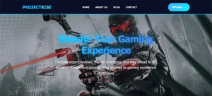
3. Hero block: explaining where the user has landed
The first screen should answer the question: what is this website about?
The following work well:
- a headline in the style of “We help people understand…”;
- a subheading describing the topic;
- a thematic image or illustration;
- a non-aggressive button: “Learn more,” “Explore,” “Read articles.”
No CTAs such as Order now, Get discount, Buy today.
Only gentle engagement.
4. Main content: the heart of the white page
This is the most important part.
The content should be:
- unique;
- readable;
- logically structured;
- relevant to the topic of the offer.
The format depends on the vertical, but the universal scheme is as follows:
![]()
Information blocks
2–4 sections with subheadings:
- description of the problem;
- overview of the topic;
- facts, research, statistics;
- tips or recommendations.
Text
Minimum 1500–2000 characters of pure text. No “fish.” Less is more, but stay on topic.
Visuals
Images, icons, sometimes tables. Stock photos are acceptable, but without overtly promotional scenes.
Internal logic
The text should look like an article or guide, not like preparation for a sale.
5. Trust block
One of the most underrated elements.
What you can add:
- About Us;
- project mission;
- brief history;
- photo of the “team” (even stock);
- mention of experts or authors.
If possible, a separate page for the author of the article. This greatly increases trust.

6. Legal pages are mandatory
Minimum set:
- Privacy Policy;
- Terms of Service;
- Contact Us.
Contact details must be real in format:
email, feedback form, sometimes address.
This is not just a formality — many rejections are due to the absence of these pages.
7. Footer: completing th
e picture
In the footer, we duplicate:
- menu;
- links to policies;
- copyright;
- project name.
The footer should look like a normal website, not an empty strip.
8. Technical issues that are often overlooked
Even perfect content won’t save you if:
- the website takes 5 seconds to load;
- there is no mobile adaptation;
- broken links;
- the fonts are crooked;
- there is no SSL.
A white page must be fast and accurate. Moderators see this.
9. Common mistakes
The things that kill a white page the fastest:
- template texts;
- direct mention of the product;
- buttons with sales;
- content that is too short;
- identical white pages for different offers;
- lack of structure.
A white page is not a placeholder. It is the face of your advertising.
Conclusion
The ideal white page is an independent project, not a technical placeholder. It should look like a real resource, be useful, and inspire trust.
If you approach the creation of a landing page as a normal website, rather than as a consumable, your approvals will grow, your accounts will live longer, and your links will become more stable.
There are no small details in arbitrage. Especially at the white page stage.